I have used network mapping for a range of different scenarios, in what I would call an amateur capacity. I see great potential in the concept and if embedded and properly resourced, I see huge potential for application in supporting a stronger civil society.
My role in the HEAR network’s Mapping and Networks for Solidarity and Campaigning is to capture progress of the project through a series of blogs and to develop awareness raising and support resources for project partners and their networks, to support uptake of network mapping in this exploratory programme.
In the first of this blog series, I hope to provide an introduction to network mapping, picking out key maps I’ve been involved with, summarising how they came into being and illustrating different use cases. I have included screenshots of maps to illustrate various points, so you’ll just have to imagine that they are interactive and clickable!
The Croydon Map
I came to network mapping in 2015 whilst working with Croydon Voluntary Action (CVA). I was helping CVA better capture stories from their Asset Based Community Development (ABCD) programmes using simple digital storytelling techniques. Whilst successfully telling the tiny stories happening across the borough, it didn’t really show the bigger picture impact of the connections being made. In the ABCD model, Community Builders meet and have conversations with local people, finding residents who have a passion and with some support, are ready to take action. Resulting hyper local initiatives emerge and Builders connect people to others in their community e.g. those interested in the same issue, or to organisations who may have assets they could utilise e.g. premises.
The scale and impact of these links made in the community is hard to quantify, so I started looking around for a mechanism to visualise this story in some way going beyond the narrative currently used - ‘in the last three months we had 55 conversations, identified 14 new community connectors and supported 3 new emerging projects’. What does that look like in a community or across Croydon?
To cut a long story short – after a chance conversation with David Wilcox (social reporter extraordinaire), and an introduction to his colleague Drew Mackie (a network mapping expert), we collaborated with CVA to build an ABCD network map showing key individuals and organisations, their connections and assets, using the relationship mapping software, Kumu.
Data was collected in person at a variety of events e.g. Ideas fairs and then the map was expanded by contacting people that had been mentioned by others and added to the map, so we could also include their connections, and so on. Drew used Survey Monkey to create an online form for data collection which was sent by email or printed out and used at face to face events. Organisations were then added to the Kumu map initially manually, and then by connecting to a spreadsheet.
We added extra information from the digital storytelling project and as the map grew, Drew created a number of different views you could switch between, depending on what you wanted to explore.
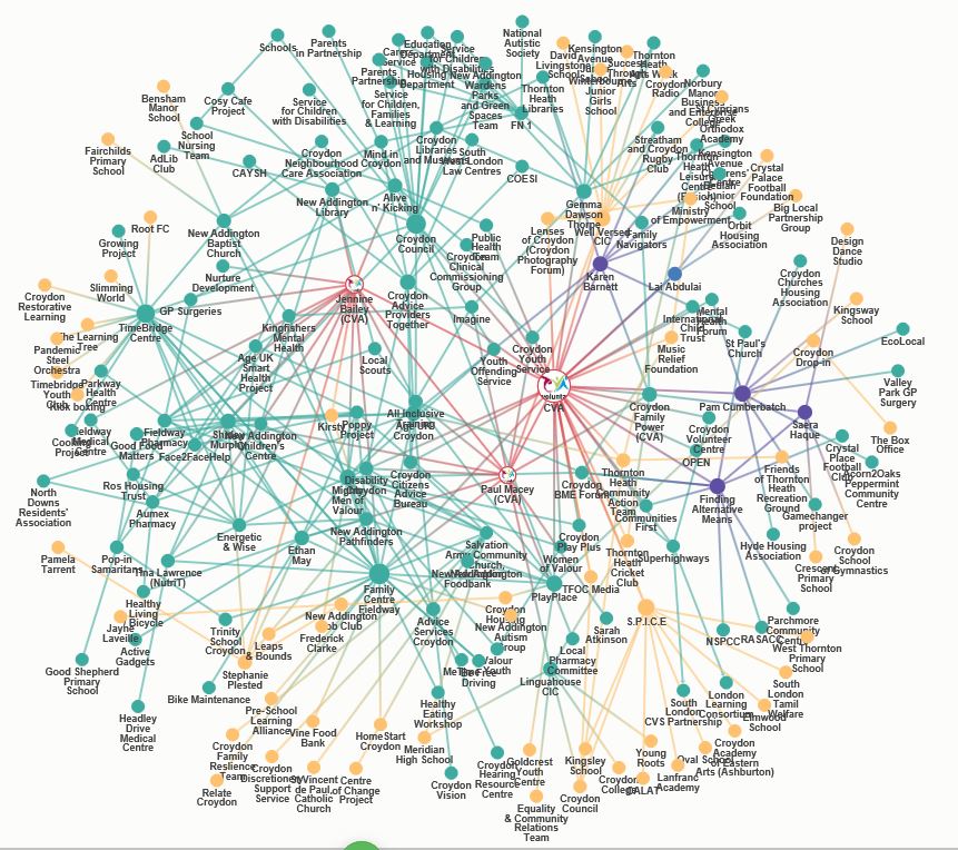
The screenshot above shows one view of the Croydon map – it might look very big, complicated and messy but to summarise it...
- Visualises the connections between individuals and organisations represented as circles or nodes on the map
- Shows growth - the yellow ‘nodes’ and links, in the map view above, shows entries added to the map after a particular date, and in this case relate to specific funding
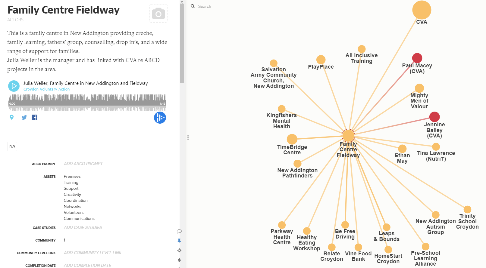
- Enables you to explore connections and assets. As shown below, clicking on a node on the map brings up a left side bar which can include a description, multi media content, contact details and assets that organisations or individuals hold. Clicking 1 on your keyboard will then zoom out to show that Organisation’s direct connections, clicking 2, will zoom out to show those organiastions’ direct connections. In this view, the red nodes represent CVA’s Community Builders.
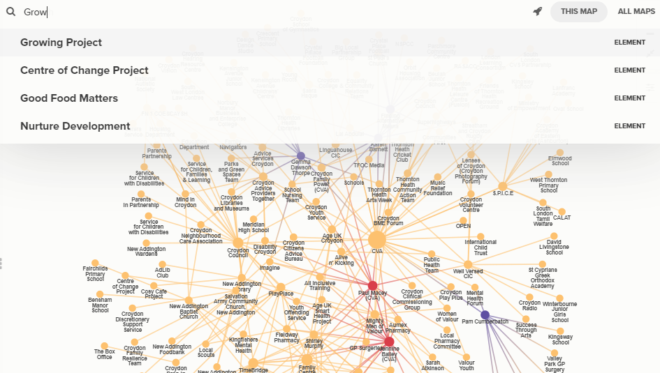
- Is searchable – as shown below, a keyword search at the top left enables you to find specific entries on the map, essential when your map becomes as big as this! So searching on the word Grow will find relevant organisations – as a Community Builder, you could then introduce these organisations / individuals to share learning or potentially work together on new initiatives in future.
Kumu also has a range of network analysis options you can run e.g. to find who is most central on the map or where there may be gate keepers etc. The above maps have different size nodes which have been automatically generated depending on numbers and nature of their connections. More on this later in the blog series.
The Outcomes 2 map
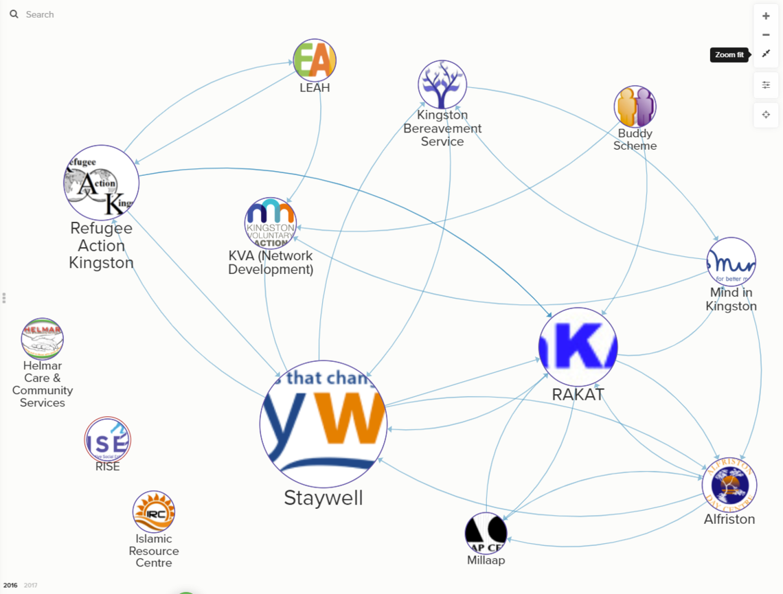
Next, I created a map of a network of organisations commissioned by Kingston Council to deliver services under their Active and Supportive Communities programme. Kingston Voluntary Action (KVA) provided a network support role, so I attended an early network meeting and asked members to indicate who they already linked with and the nature of this relationship.
This is the map I created in 2016.
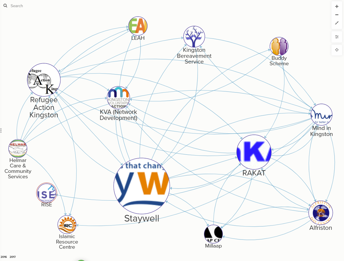
We repeated the exercise a year later and using the Year tags (see the bottom left), the map below shows the 2017 view, with many more links. Although we can’t attribute all of these new connections to working together as a more formalised network, this was included when reporting back to the commissioner.
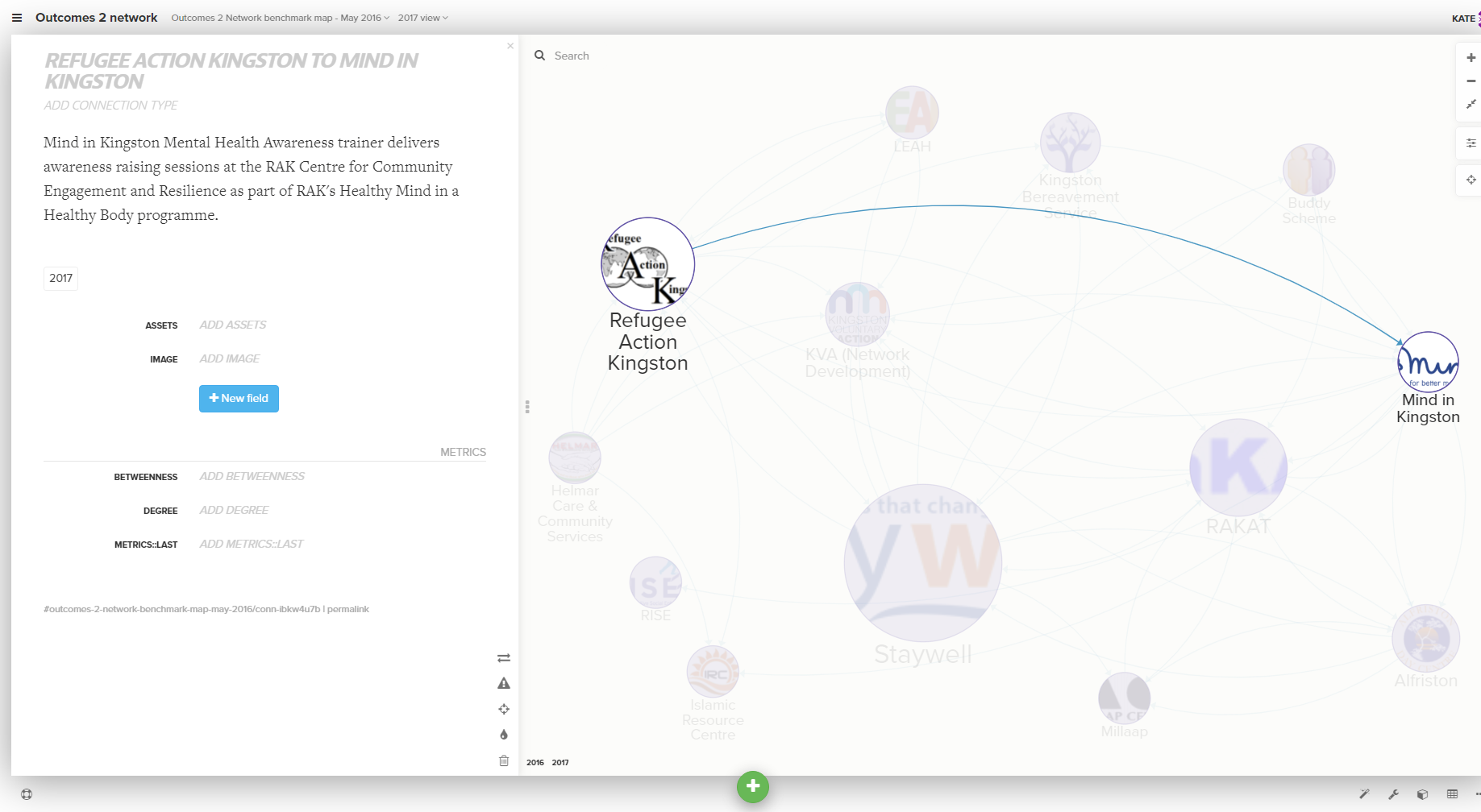
You may have noticed that the links in this map are directional i.e. there are arrows showing which organisation has sited the connection. Similar to being able to add information about a node to the map, you can also provide information about a link. Below I have hightlighted one of the new links made in 2017 and details about the nature of this connection provided by the organisation are shown in the left bar.
We also investigated a similar map for the Kingston Information and Advice Alliance. This came at a time when there was uncertainty about future funding for a number of members. We were interested to see if network mapping could help campaign against upcoming cuts, if we were able to show the impact of a particular organisation being lost from the map, along with all their connections. And in the worst case scenario, how the network could utilise the map to plug gaps or link remake connections via other intermediaries.
The Kingston map
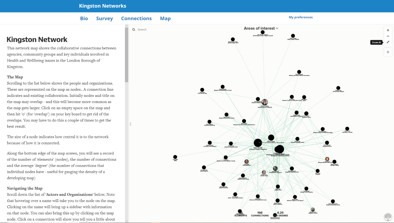
Following this work, in 2018 I next initiated a mapping project with the Kingston Health & Wellbeing network, again facilitated by Kingston Voluntary Action. This was partly in response to comments from commissioners that the voluntary sector didn't work together as much as it could, and it also coincided with a new boroughwide social prescribing programme in early stages of development.
Working again with Drew, it was the first time too that I had direct experience of linking the Sum app online survey tool with Kumu. This has a number of advantages – it enables a network map to be automatically created from survey responses, and then for people on the map, to receive a unique link so they can update their profile information and add / remove connections themselves.
When invited to join the map by email you first provide further information about yourself in the Bio tab and then you can select existing people / organisations you connect with in the Connections tab.
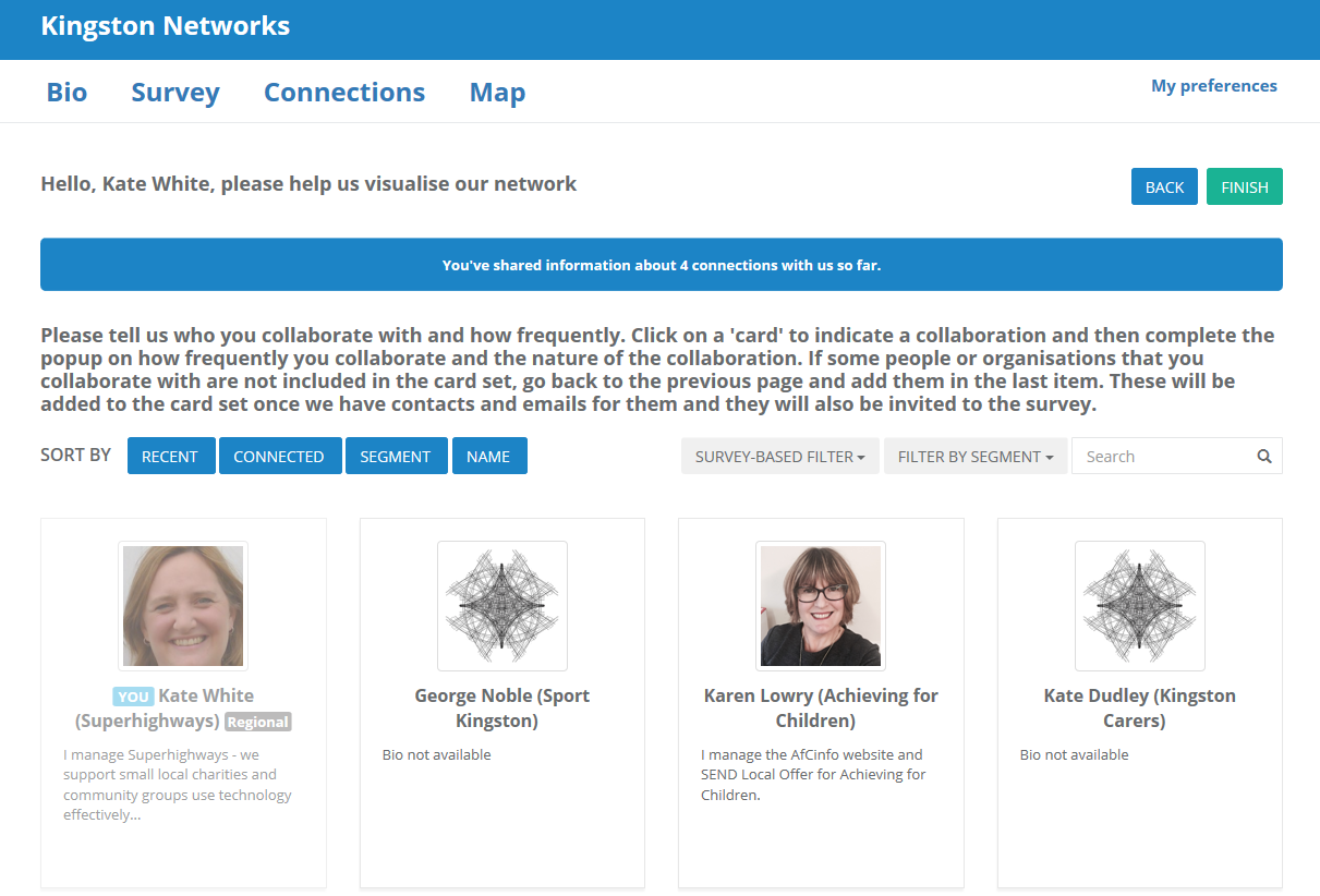
After selecting someone you connect with, we decided to ask how often people collaborated with each other. The idea was to encourage people to only site people or organisations they do actually work with, rather than just know about. This information can then be used by Kumu’s network analysis, allowing it to take into account the strength of connections in the map. For example, someone might be connected to 20 other people, but if they only occasionally collaborate with them, this maybe isn’t as important as constantly collaborating with only 10.
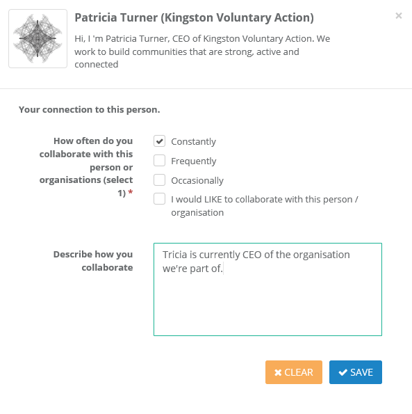
As shown above, you can also give people an opportunity to select individuals / organisations that they’d like to collaborate with in future. As map managers, we could then pull out this information and make introductions. It might even be possible to create a map view just showing these aspirational connections.
Then once completed, the live map is presented in the Map tab – meaning respondents don’t need to leave the Sum app tool to see their information on the map.
Due to staff turnover at Kingston Voluntary Action, this map is currently paused, but there are hopes to relaunch this work in 2020.
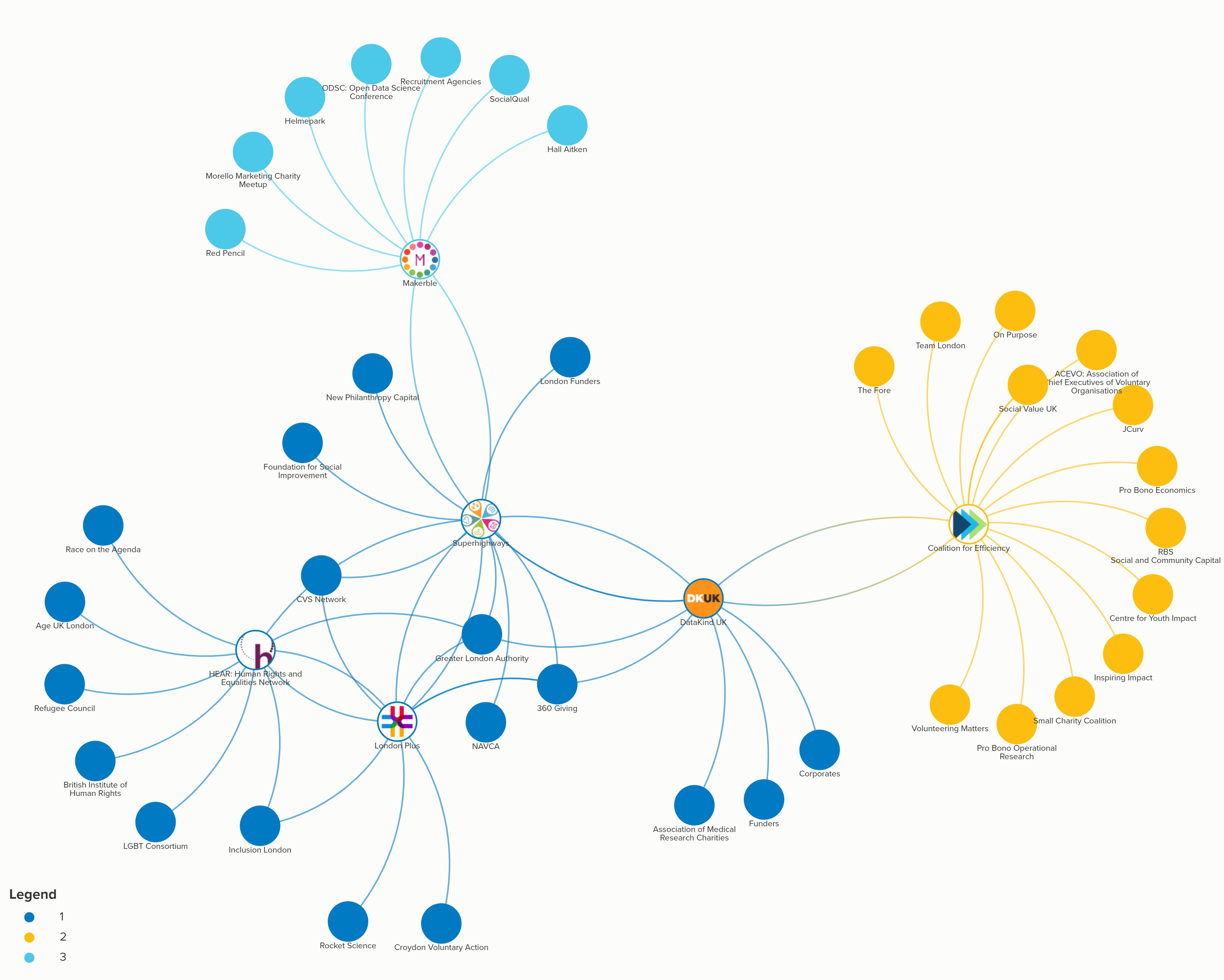
The Datawise London map
So coming up to date in 2019, this next map was created following an initial partnership meeting for the new Datawise London programme Superhighways are leading on. I asked each of the 6 partners to draw out their main.
As one of our aims is to connect expertise from partners' networks to small frontline London charities, we will revisit this map at each of our partnership meetings and add in new organisations / connections formed, and use the map as an evaluation tool.
The HEAR Network maps
In this next chapter, I’m really looking forward to supporting the HEAR Network and partners in this two year exploratory project, testing how network mapping can help their networks come together and campaign on equalities and human rights issues in London. Key to success will be the Network Development Officer post, just recruited, and with whom Drew, David and I will work closely.
Published: 05 Nov 2019 by Kate White